The CSS Box Model
A CSS rule is rendered as a box, a rectangular area that has content. We can visualize that box as in the following image:
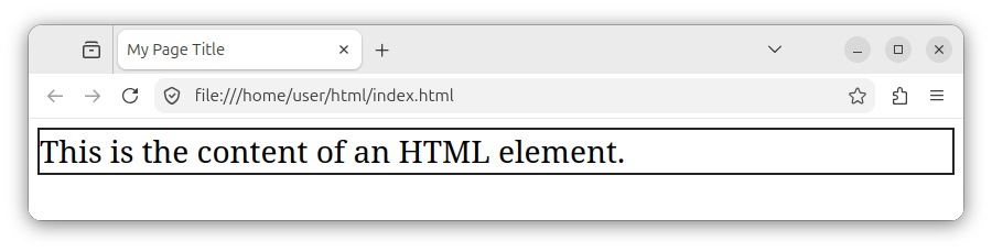
That content can be an HTML element's text, or it can be made up of other child elements and their respective boxes. In short, when we apply a CSS rule to an HTML element, the browser renders that element as a rectangular area.
Sometimes, depending on the styling and the nature of the HTML element, that box can have a fixed width, as in the following image:
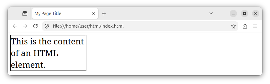
And sometimes, if the content cannot fit into fixed-size box dimensions, it will overflow the rectangle's boundaries, but it will still be visible as in the following image:
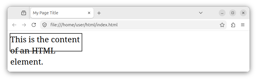
By default, the rectangle's content is contained within the rectangle area, but in some cases, due to the container's styling and the content length, the content might overflow the box.
If there are multiple HTML elements on a page, and each element has a certain CSS styling, then each element can be visualized as a separate box:
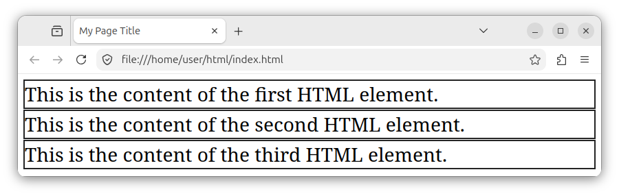
Depending on the actual styling and layout used, multiple CSS boxes can also have different positions and dimensions:
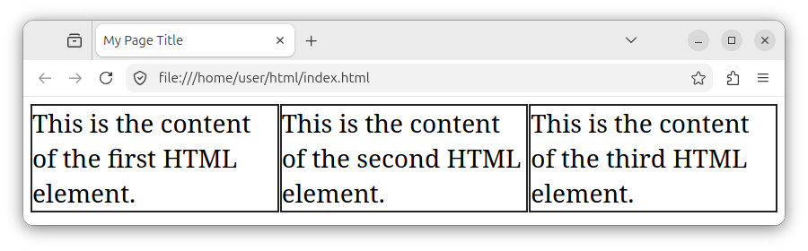
Note: By default, the container box does not have a border nor margins, as in our previous images. The border is there to help us better visualize the CSS box and its content.
So far, we have learned that a CSS rule is rendered as a box. This box:
- Is represented as a rectangular area that has some content.
- Has a certain position relative to other elements on the page.
- Has a height and width, which can be set either automatically or manually.
- The rectangle's content might be contained within the boundaries of the box, or it can overflow the box.
Block-level and inline elements
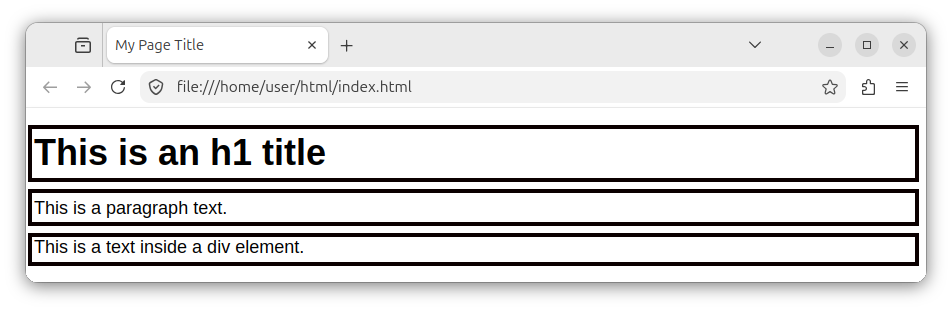
HTML elements use a specific display type by default. Some HTML elements, such as div, h1, and p, are block-level elements. The following HTML snippet:
<h1>This is an h1 title</h1>
<p>This is a paragraph text.</p>
<div>This is a text inside a div element.</div>
Can be visualized as shown in the following image, where each HTML element takes up the full width of its parent container and starts on a new line:
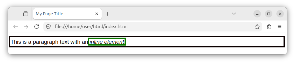
Other elements like em, a, and strong, are inline elements. The following snippet shows a paragraph element that wraps an inline em element:
<p>This is a paragraph text with an <em>inline element</em>.</p>
The paragraph itself is a block-level element, while the <em> element is an inline element by default. The source code above can be visualized using the following image:
Using the display CSS property, we can explicitly specify whether the styled element will act as a block-level element, as shown in the following snippet:
.my-class-block {
    display: block;
}
Or as an inline element, using the following CSS snippet:
.my-class-inline {
    display: inline;
}
The block-level box, which can be explicitly set via the display: block; CSS property, has the following properties:
- The box breaks onto (starts on) a new line.
- We can use the CSS
widthandheightproperties on such a block to modify its dimensions. - The box takes up (expands to) the full width of its parent container.
The inline-level box, which can be explicitly set via the display: inline; CSS property, has the following properties:
- The box does not break onto a new line.
- The content of the box flows inline relative to the parent container's other content.
- The
widthandheightproperties do not have an effect on such a box, even if they are specified.
The internal box layout
So far, we have talked about the display property and its block and inline values, which determine how the box behaves and is positioned relative to other boxes on the page. This is referred to as the external display type.
Now, we will introduce new property values that specify the internal display type, or the layout of child elements. For example, the display: flex; property modifies internal positioning and layout. It affects how internal boxes are positioned and arranged within our container box.
The following CSS snippet:
.container {
    display: flex;
    flex-direction: row;
    gap: 5px;
}
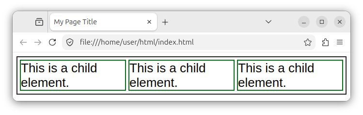
Specifies that our HTML will represent the so-called flex container, which determines the layout of internal child elements. All the child elements (boxes) within this element will be positioned in a row with a five-pixel gap between them.
The following HTML snippet:
<div class="container">
    <div>This is a child element.</div>
    <div>This is a child element.</div>
    <div>This is a child element.</div>
</div>
Can then be visualized as in the following image:
Note: We will have a dedicated tutorial for the flex container later in this course. For now, we should just get a top-level overview of how it can be used to specify the internal layout of a box.
Box areas
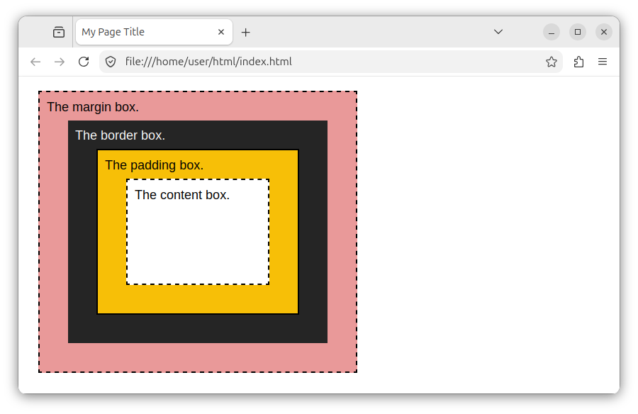
The CSS box itself is made up of several different areas:
- The content area - affected by the
widthandheightCSS properties. - The padding area - affected by the
paddingCSS property. - The border area - affected by the
borderCSS property. - The margin area - affected by the
marginCSS property.
The following image shows how we can visualize the different areas (different boxes) within our main CSS box:
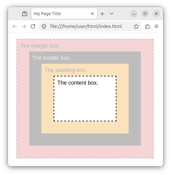
The content box (the content area) is a rectangular area where our content lives. It is the innermost rectangle in our image:
The padding area surrounds our content area and represents the spacing between our content area and our border area:
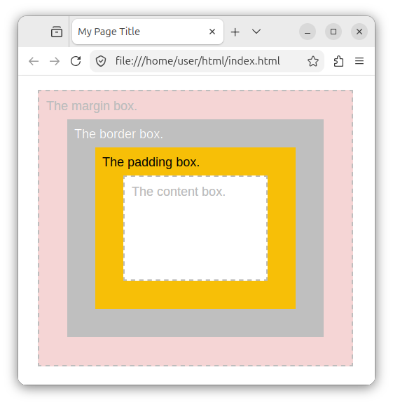
This spacing can be modified using the padding: some_value; property.
Then, there is an outer rectangle that is used to display a border:
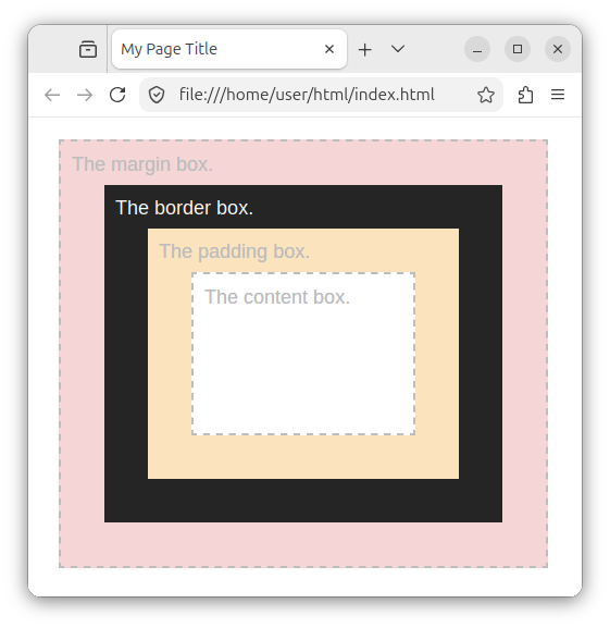
This area can be modified using various values specified inside the border CSS property.
Finally, there is a surrounding margin area which represents the spacing between our box and surrounding elements/boxes:
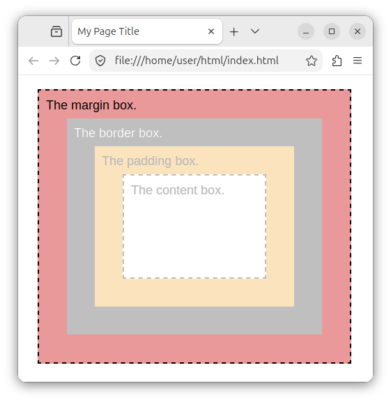
This spacing can be modified using the margin CSS property.
Note: We will have separate tutorials for padding, border, and margins. For now, it is important to get an overview of how our CSS box is structured.
Summary
A CSS rule is rendered as a box, as a rectangular area. That area is usually displayed as a block-level area/element or an inline element. This behavior can be controlled using the display CSS property. The internal positioning and layout of child elements can be controlled using the display: flex; CSS property applied to the parent container/box. Finally, the box is made up of four major areas: the content, the padding, the border, and the margin area.


