HTML Forms with Radio Buttons
To create a form that has a group of several radio buttons, where only one radio button can be selected, we place several <input type="radio"> fields inside a <fieldset> element that groups them together. Example:
<form action="some-page" method="post">
    <fieldset>
        <legend>Choose an option:</legend>

        <input type="radio" name="my-option-name" id="option-1" value="option-1-value" checked>
        <label for="option-1">Option 1</label>

        <input type="radio" name="my-option-name" id="option-2" value="option-2-value">
        <label for="option-2">Option 2</label>

        <input type="radio" name="my-option-name" id="option-3" value="option-3-value">
        <label for="option-3">Option 3</label>
    </fieldset>

    <button type="submit">Submit</button>
</form>
Note: Replace some-page with your actual page name.
Individual radio buttons are represented by <input type="radio"> fields, and each button has an associated <label> component which provides a caption for the radio button. Only one radio button within the group can be selected. All radio buttons are grouped together using the <fieldset> element, and the caption/title of the entire group is represented through the <legend> element.
When rendered in a browser, this form shows three radio buttons, represented by circles, and next to each circle is label text coming from the associated <label> element:
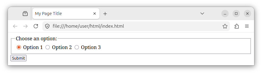
Radio buttons
Each radio button is represented by the <input> element whose type attribute is set to the value of "radio":
<input type="radio">
The radio button's name attribute
All radio buttons within the group should have the same name attribute value. By having the same name value in all radio buttons, we specify that only one radio button within the group can be selected:
<fieldset>
    <input type="radio" name="my-option-name">
    <input type="radio" name="my-option-name">
    <input type="radio" name="my-option-name">
</fieldset>
The radio button's id attribute
Each radio button control can optionally have an id attribute with a unique value:
<input type="radio" name="my-option-name" id="option-1">
<input type="radio" name="my-option-name" id="option-2">
<input type="radio" name="my-option-name" id="option-3">
By using the id attribute, we can manipulate radio buttons in JavaScript, apply CSS styling, and associate a label with a radio button.
Adding a label to the radio button
The id attribute can be used to associate a label with a radio button using the <label> element:
<input type="radio" name="my-option-name" id="option-1">
<label for="option-1">Option 1</label>
Notice how the <label> element is positioned after the radio button control. This is because we want the radio button's circle to appear first, and the associated label's text second.
The radio button's value attribute
All radio buttons should have a value attribute, which is a string that represents the value for each radio button. Once the form is submitted, we can use this value to determine which radio button was selected:
<input type="radio" name="my-option-name" id="option-1" value="option-1-value">
<input type="radio" name="my-option-name" id="option-2" value="option-2-value">
<input type="radio" name="my-option-name" id="option-3" value="option-3-value">
The selected-by-default radio button
To make one radio button selected by default, we add the checked attribute to the radio button:
<input type="radio" name="my-option-name" id="option-1" value="option-1-value" checked>
The required element
If at least one radio button within the group must be checked, then we add the required attribute to any radio button within the group:
<fieldset>
    <legend>Choose an option (required):</legend>
    <input type="radio" name="my-option-name" id="option-1" value="option-1-value" required>
    <input type="radio" name="my-option-name" id="option-2" value="option-2-value">
    <input type="radio" name="my-option-name" id="option-3" value="option-3-value">
</fieldset>
The presence of the required attribute on any of the radio buttons means that at least one of the buttons in this radio group must be checked/chosen when submitting a form.
The <fieldset> element
The <fieldset> element is used to create a group of several controls on our form. It creates a collection of several controls that belong to the same category in some logical manner. In our case, the <fieldset> element represents a group of three radio buttons and three labels:
<form action="some-page" method="post">
    <fieldset>
        <input type="radio" name="my-option-name" id="option-1" value="option-1-value" checked>
        <label for="option-1">Option 1</label>

        <input type="radio" name="my-option-name" id="option-2" value="option-2-value">
        <label for="option-2">Option 2</label>

        <input type="radio" name="my-option-name" id="option-3" value="option-3-value">
        <label for="option-3">Option 3</label>
    </fieldset>

    <button type="submit">Submit</button>
</form>
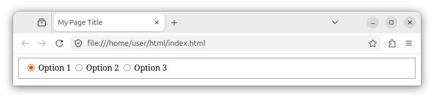
When rendered in a browser, the <fieldset> element is represented as a rectangular area with a border that wraps around the inner controls.
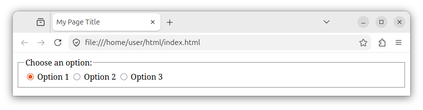
If a <fieldset> has a <legend> element, the browser will use that text to display a caption in the fieldset's upper left corner.
Multiple fieldsets
Our form can also have multiple fieldsets, listed one after the other:
<form action="some-page" method="post">
    <fieldset>
        <legend>The first set of options:</legend>
        <input type="radio" name="my-option-name" id="option-11" value="option-11-value" checked>
        <label for="option-1">Option 1.1</label>

        <input type="radio" name="my-option-name" id="option-12" value="option-12-value">
        <label for="option-2">Option 1.2</label>
    </fieldset>

    <fieldset>
        <legend>The second set of options:</legend>
        <input type="radio" name="my-option-name-2" id="option-21" value="option-21-value" checked>
        <label for="option-1">Option 2.1</label>

        <input type="radio" name="my-option-name-2" id="option-22" value="option-22-value">
        <label for="option-2">Option 2.2</label>
    </fieldset>

    <button type="submit">Submit</button>
</form>
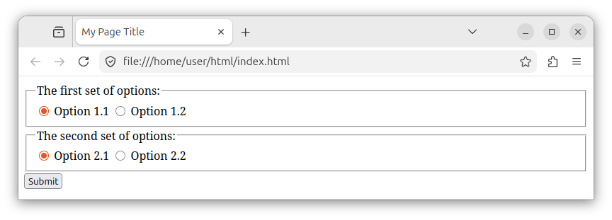
Here, each <fieldset> element carries its own set of radio buttons and labels. Radio button controls inside the first fieldset share one name, and radio buttons inside the second fieldset share another name.
When rendered in a browser, the form with two sets of radio buttons looks like the following:
Note: If needed, the fieldsets can also be nested in other fieldsets.
Disabled fieldsets
To disable all controls inside a <fieldset> element, we add the disabled attribute to the fieldset:
<form action="some-page" method="post">
    <fieldset disabled>
        <legend>All the controls have been disabled:</legend>
        <input type="radio" name="my-option-name" id="option-1" value="option-1-value" checked>
        <label for="option-1">Option 1</label>

        <input type="radio" name="my-option-name" id="option-2" value="option-2-value">
        <label for="option-2">Option 2</label>
    </fieldset>

    <button type="submit">Submit</button>
</form>
The <legend> element
To set the label/caption for our fieldset, we place a <legend> element inside the <fieldset> element. The <legend> element provides a label (a caption) for its parent element. In our case, it provides a label/caption for our <fieldset> group.
<form>
    <fieldset>
        <legend>Choose an option:</legend>

        <!-- Labels and radio buttons here -->
    </fieldset>
</form>
The full HTML page listing
The following index.html file shows a complete web page that has a form with several radio buttons:
<!DOCTYPE html>
<html lang="en">
<head>
    <meta charset="UTF-8">
    <meta name="viewport" content="width=device-width, initial-scale=1.0">
    <title>My Page Title</title>
</head>
<body>
    <h1>A form with radio buttons</h1>
    <form action="some-page" method="post">
        <fieldset>
            <legend>Choose an option:</legend>

            <input type="radio" name="my-option-name" id="option-1" value="option-1-value" checked>
            <label for="option-1">Option 1</label>
            <br>

            <input type="radio" name="my-option-name" id="option-2" value="option-2-value">
            <label for="option-2">Option 2</label>
            <br>

            <input type="radio" name="my-option-name" id="option-3" value="option-3-value">
            <label for="option-3">Option 3</label>
        </fieldset>
        <br>

        <button type="submit">Submit</button>
    </form>
</body>
</html>
The above web page has a form with three radio buttons and a submit button:
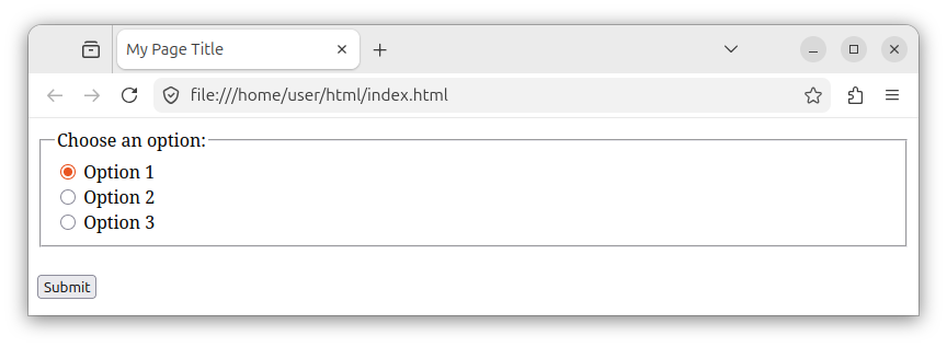
Note: Here we used several <br> elements to display radio button/label pairs on separate lines. In production, you should nest radio buttons and labels inside separate <div> or list item <li> elements placed inside a form:
<div>
    <input type="radio" name="my-option-name" id="option-1" value="option-1-value" checked>
    <label for="option-1">Option 1</label>
</div>

<div>
    <input type="radio" name="my-option-name" id="option-2" value="option-2-value">
    <label for="option-2">Option 2</label>
</div>
Summary
In summary, to create a form with several radio buttons, we use multiple <input type="radio"> elements to create radio buttons and place them inside the <fieldset> group element.
All radio buttons within a group should have the same name attribute value, which ensures only one radio button can be selected. Radio buttons should also have id and value attributes, and each radio button element should be followed by an associated <label> element.


