Introduction to HTML Forms and Form Controls
A form is an HTML element that can be used for accepting input from a user and submitting that input to a server for processing. We also say that a form allows the user to interact with our web page.
A form element usually contains several child elements, referred to as form controls or input controls. Some of these controls are:
- Labels and matching text boxes.
- Buttons.
- Text areas.
- Dropdowns.
- Email and password inputs.
The following image is an example of a form with multiple controls:
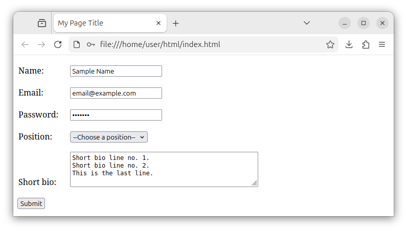
Note: A form can also contain other, non-input HTML elements such as headings, paragraphs, divs, and similar.
The user enters the data into a form by entering the data inside multiple input control elements. The user then clicks on the Submit button or presses the Enter key on a keyboard to submit the form's data.
The form element starts with the <form> opening tag and ends with the </form> closing tag. The form's content is placed between these two tags:
<form>
    <!-- The form content goes here -->
</form>
The form's content is usually made up of multiple child elements—multiple input controls, which we will cover later in this tutorial.
Form's attributes
A form has two very important attributes: action and method.
The action attribute
The action attribute specifies the URL of a server page to which we submit our form's data. If we want to submit the form's data to some process-form page for processing, we set the form's action attribute to the value of: "process-form" string. Example:
<form action="process-form">
    <!-- The form content goes here -->
</form>
This form will be submitted to some process-form page. This page is usually a PHP, ASPX or similar script that takes the form data, inserts, updates, or deletes a record, logs the user in and out, checks if the provided answer is correct.
To submit a form to a page using the site root relative path, we include the / symbol:
<form action="/process-form">
    <!-- The form content goes here -->
</form>
To submit a form to a differently named page, for example, the submit-data page, we write:
<form action="submit-data">
    <!-- The form content goes here -->
</form>
The method attribute
The method attribute specifies whether the form's data will be submitted through GET or POST HTTP requests.
If we choose the GET method, all the form's data will be appended to the action URL and sent as publicly visible parameters.
The following code snippet specifies that the form will be submitted using the GET HTTP request:
<form action="submit-data" method="get">
    <!-- The form content goes here -->
</form>
In this case, all the form's data gets appended to the URL and is transferred via the GET request. The URL gets appended with the ? symbol, followed by field-name=field-value key-value pairs separated by & symbols. There will be as many key-value pairs in the URL as there are input fields in the form. After submitting a form using the GET method, depending on the fields in your form, you might see a URL in your browser that looks similar to:
/submit-data?email=test%40example.com&password=pass123&submit=Submit
The POST method sends the form's data by attaching it to the body of the HTTP POST request and does not expose the form's data in the URL.
When submitting the form, most of the time, we want to use the POST method instead; we want to submit our form through the POST HTTP request. Example:
<form action="submit-data" method="post">
    <!-- The form content goes here -->
</form>
In summary, most of the time, we want to set the form's method attribute to the value of POST. This way, when we submit the form, the form's data is sent through the POST HTTP request that does not expose sensitive form data (such as password fields) in the URL.
The <input> element's attributes
The input element has several important attributes:
type- specifies the type of the input control.name- specifies the name for the input control.id- specifies the control's ID used by JavaScript code or to associate thelabelelement with a control.required- specifies that the data for the control must be entered before the form is submitted. We say that controls with therequiredattribute are required and are not optional. If the field is indeed optional, we leave out this attribute.value- sets the initial value of the input control.
In production, the type, name, and id attributes are almost always present.
The text box control
To declare a text box element that can accept any string, we use the <input> element and set its type attribute to the value of "text". A source code example of a text box control used to accept the first name is:
<input type="text" name="first-name">
This code snippet creates a text box control whose name attribute is set to some unique "first-name" value. The script that processes the form uses the control's name to fetch the control's value/data.
It is good practice to also include the id parameter for a text box, as the control's ID is:
- Used by JavaScript code.
- Used to associate a label with a text box control.
The source code for the text box with both name and id attributes is:
<input type="text" name="first-name" id="first-name">
The id value usually matches the name attribute's value and should be a unique value on a web page.
The text box control should be positioned inside the form, so the source code becomes:
<form action="submit-data" method="post">
   <input type="text" name="first-name" id="first-name">
</form>
The browser renders the above code as a form with one text field:
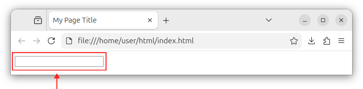
When we enter data into a text box and press Enter, the form will be submitted to a designated destination (the submit-data URL in our case), using the designated method (the POST method in our case).
To set the initial value for the text box control, we use the value attribute:
<input type="text" value="Some initial text">
Labels
The <label> element stores a text that represents a label for the associated form control. The labels get associated with a control by specifying the label's for attribute and setting it to some control's ID value. Example:
For example, we can have a text box whose ID is equal to "first-name", and we want to associate a label with that control. In that case, we write:
<label for="first-name">Name</label>
<input type="text" name="first-name" id="first-name">
This snippet shows a label and a text box control. The text box control is used for accepting a first name and has an ID value of "first-name". The label is associated with this particular text box by specifying the for attribute and setting it to the value of a control's ID, in our case, to the value of "first-name".
A fully functional form with the label control (associated with a text box field), a text box control, and a Submit button looks like the following:
<form action="submit-data" method="post">
    <label for="first-name">Name:</label> <!-- A label for the first-name text box control -->
    <input type="text" name="first-name" id="first-name"> <!-- A text box control with an ID of first-name -->
    <button>Submit</button><!-- A button that submits the form -->
</form>
The browser now renders a form with the label component, the associated text box component, and a Submit button:
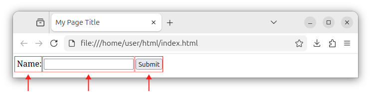
A label's text should describe what the associated field is meant to accept. For example, the label text can have the following values: Name, First Name, Last Name, Email, Password, Address, ZIP Code, Country and similar text, depending on what the associated field was meant to accept.
Labels are also used by screen readers, and when we click on the label element, the associated field control receives the focus.
A button that submits the form
A form usually has a button, which, when clicked on, submits the entire form. The button can be created using the <button> opening tag, followed by a button text and a closing </button> tag. Example:
<button>Submit</button>
We place this button inside the form, usually after all the input controls:
<form action="submit-data" method="post">
    <input type="text" name="first-name" id="first-name">
    <button>Submit</button>
</form>
When a <button> element is placed inside the form, its default role/behavior is to submit the form. Our form now has a text box and a button. When we click on a button located inside the form, the form will be submitted.
If you want to explicitly specify that a button is used to submit the form, you can add the type="submit" attribute to a button:
<button type="submit">Submit</button>
You will often see the above code in production, but, if you only have one button in a form, the type attribute is usually not required. A simple <button> element (without any attributes) placed inside the form is the button that submits the form.
While you can also create the form's submit button using the <input> element with the type="submit" attribute:
<input type="submit" value="Submit the form">
You should prefer the <button> element instead as it offers more control and is semantically more correct. In summary, use the following code to create a submit button:
<button>Submit</button>
Or, if you want to be more explicit about the button's role, add the type="submit" attribute:
<button type="submit">Submit</button>
And place that code inside a form, usually at the end of a form, before the closing </form> tag:
<form action="submit-data" method="post">
    <!-- Other form controls -->
    <button>Submit</button><!-- A button that submits the form -->
</form>
Email and password fields
There are more specific kinds of text box elements, such as text boxes used to enter an email or a password.
The email field
To represent an email field control, add the type="email" attribute to the <input> element:
<input type="email">
As before, we should also add a name and id attributes to our input element:
<input type="email" name="my-email" id="my-email">
The email input control performs client-side validation to check if the entered email is properly formatted. If we entered a value that is not a properly formed email value, the browser will issue a warning and will not submit the form.
If an email field is a required field, we add the required attribute to a control:
<input type="email" name="my-email" id="my-email" required>
To set an initial value for the email field, use the value attribute:
<input type="email" name="my-email" id="my-email" required value="email@example.com">
The use-case for a value attribute: using the email field to edit an existing record from a database. In this case, the value attribute can be used to set the text for the email box.
The password field
To represent a field that accepts passwords, we use the <input> element and set its type attribute to the value of "password". Example:
<input type="password" name="my-password" id="my-password">
The password field does not display the password characters and obscures them using special characters as we type.
Example
The following source code defines an HTML form with email and password fields and a submit button:
<form action="submit-data" method="post">

    <label for="my-email">Email:</label>
    <input type="email" name="my-email" id="my-email" required>

    <label for="my-password">Password:</label>
    <input type="password" name="my-password" id="my-password" required>

    <button>Submit</button>
</form>
The form also has two label components, one for the email field and one for the password field. Both email and password fields are marked as required fields.
When rendered in a browser, the above form looks as follows:
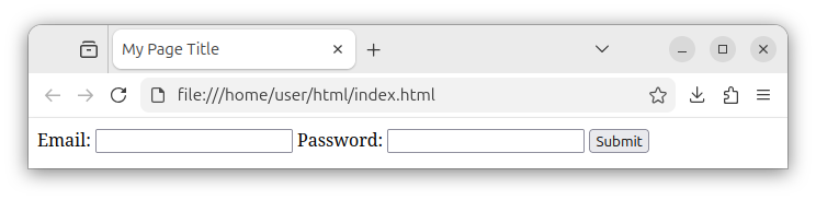
Note: Do not worry about the "crude" looks of a default form and other HTML elements as they do not have any CSS styles applied yet. Currently, we are focused on learning the proper HTML, the proper syntax and the semantics, and not on looks and CSS styling of our element. We have a separate tutorial that deals solely with CSS styling and appearance of our HTML elements.
The dropdown field
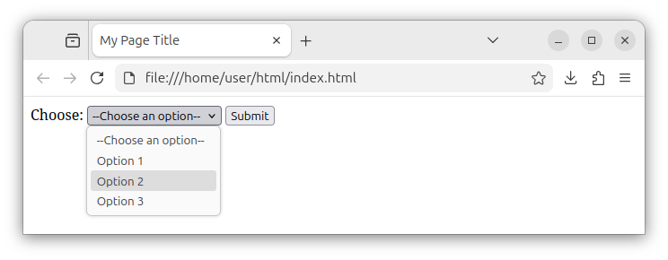
The dropdown control is a control that offers multiple options to choose from in the form of a dropdown list. The dropdown control is created through the <select> element, and multiple options within that dropdown are created using multiple <option> elements.
To create a dropdown control that offers three options (an info message + two options), we write:
<select name="my-dropdown" id="my-dropdown">
    <option value="">--Choose an option--</option>
    <option value="option1">Option 1</option>
    <option value="option2">Option 2</option>
</select>
The <select> element creates a dropdown field control with several options. We also added name and id attributes to our control, and we set them both to some value of "my-dropdown". Since our dropdown control offers multiple options, the <select> element stores multiple <option> elements.
Each <option> element represents a different item within our dropdown control. In between the opening and closing option tags, we place some descriptive text that will be displayed for each option. The <option> element has a value attribute that specifies the data value to be submitted in case this option was selected. Depending on which option we choose, this data will be the data submitted for the dropdown control when the entire form is submitted.
For example, if we choose the Option 1 and submit the form, the value of our dropdown control becomes option1 as that is the value specified for the Option 1 item. If we opted for Option 2, the dropdown control will be submitted with the value of option2 and so on.
The selected option
If we want to set the particular option as the initially selected option, we add the selected attribute to that <option> element. Example:
<select name="my-dropdown" id="my-dropdown">
    <option value="">--Choose an option--</option>
    <option value="option1" selected>Option 1</option>
    <option value="option2">Option 2</option>
</select>
The above code sets the Option 1 as the selected option for our dropdown control when the web page is displayed.
To set the Option 2 as the selected one, we write:
<select name="my-dropdown" id="my-dropdown">
    <option value="">--Choose an option--</option>
    <option value="option1">Option 1</option>
    <option value="option2" selected>Option 2</option>
</select>
Example
The following source code example shows a form with a label and a dropdown control with multiple options:
<form action="submit-data" method="post">

    <label for="my-dropdown">Choose:</label>
    <select name="my-dropdown" id="my-dropdown">
        <option value="">--Choose an option--</option>
        <option value="option1">Option 1</option>
        <option value="option2">Option 2</option>
        <option value="option3">Option 3</option>
    </select>

    <button>Submit</button>
</form>
The above form has a label, an associated dropdown control with multiple options, and a submit button:
The text area control
A text area is a control that can accept multi-line text. The control is created using the <textarea> element. Example:
<textarea>
<!-- Regular, multi-line text goes here -->
<!-- And here -->
</textarea>
The text area element starts with a <textarea> opening tag, has an optional initial text and ends with a </textarea> closing tag. Unlike a text box, the text area can indeed accept multi-line plain text.
As before, we should add a name and id attributes to our control:
<textarea name="my-textarea" id="my-textarea">
<!-- Initial text, if any -->
</textarea>
The rows and cols attributes
To specify how many lines of text the text area will show, we use the rows attribute:
<textarea name="my-textarea" id="my-textarea" rows="10">
<!-- Initial text, if any -->
</textarea>
This text area will show ten lines of text. It will be ten lines of text high.
To specify how many columns of characters the text area will show, we use the cols attribute:
<textarea name="my-textarea" id="my-textarea" cols="50">
<!-- Initial text, if any -->
</textarea>
This text area can display 50 columns of characters; it is 50 characters wide.
In production, both rows and cols attributes are usually specified and used together:
<textarea name="my-textarea" id="my-textarea" rows="10" cols="50">

</textarea>
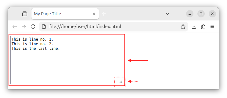
The browser renders the text area as a rectangular control that can accept regular, multi-line text.
In the text area's bottom right corner, the browser displays a handle that allows us to resize the control using our pointer.
The text area's initial text
To set the initial multi-line text for a text area control, we place the initial text between the opening <textarea> and closing </textarea> tags:
<textarea name="my-textarea" id="my-textarea" rows="10" cols="50">
This is line no. 1.
This is line no. 2.
This is the last line.
</textarea>
When rendered in a browser, the above code displays a text area control that has multiple lines of text.
In summary, the text area represents a control that can store regular, multi-line text that contains new lines, tabs, special characters and similar. In production, it is often used to store and display raw HTML source code.
Forms summary
A form is an HTML element that wraps several forms controls and is used to accept input from a user and send that input data to a designated server page for further processing.


